Tim Walker - Wonderful Things
Stepping into Tim Walker’s Wonderful Things Exhibition at the V&A Museum was like tumbling into Walker’s own wonderland.
Entering the first room is a shock; sterile, fluorescent lights creating a washout of white. Highlighting the familiarity of Tim Walker’s fashion photography with the likes of Vogue, a taster before the madness that was to follow.
The rooms that followed contained ten new photographic projects that were directly influenced by items in the V&A's archive, each treasure was immersed in a fantastical set that had been built around them by long term collaborator, designer Shona Heath.
Each room felt as if you were walking within the photograph, a celebration of Walker’s photography as much as it is a celebration of the artefacts from the museum.
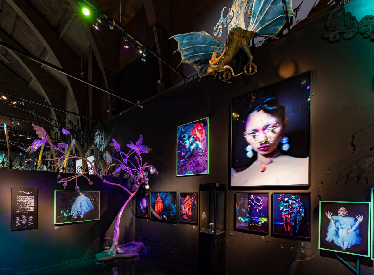
One particular section was very memorable to me, ‘Lil’ Dragon’, the room was dark, and UV lit, containing neon colours that accented the space and drew attention to the photographs. The set work by Shona Heath was a perfect balance that didn’t take away from Walker’s photographs but enhanced the experience of them. “As soon as I saw this tiny object, I could see the story of an emperor or an empress, walking their pet dragon at night-time and picking a flower that only blooms at full moon. We turned that into two empresses, two queens.” Tim Walker on describing the small snuff box that inspired this series of work. The dark and decadent energy felt very modern in contrast to the artefact, leaning to how fashion has changed in modern day.
There are many strengths of the exhibition, such as all audiences could enjoy this installation, whether they were familiar with Tim Walker’s work or new. Walker also makes sure to have a diverse range of models, from all ages, races and gender. One section that stood out was Cloud 9 featuring British-Asian models that had been drenched in glitter. The colours were so rich and vibrant – celebrating the mix of cultures and the love of art.
The exhibition as a whole inspired me because it was so carefree and expressive, each section felt like a new dreamscape to unwrap. Tim Walker had taken great care into turning these artefacts into a series of art, it felt very much like a celebration of the single item, as in each room the object that sparked the inspiration was placed in the scene.
One weakness I found within this exhibition was the ‘Chapel of Nudes’. Secluded behind a pink latex curtain was a small room with a variety of photographs of nude models. Some were tasteful, but I couldn’t help but notice that a lot of the images that featured women felt like they were photographed because they were women. This was the same for any model that was plus sized, they were photographed in a way that just made the viewer feel gross for watching. Clown makeup, food and an unflattering posture. Meanwhile the majority of men that were photographed seemed to be elevated to a higher plane; to be worshiped and honoured for whatever gift they have. This is quite typical of the male gaze; women are objectified while men are idolised – almost exclusively for the pleasure of other men.
In conclusion, Tim Walker’s Wonderful Things was exactly that: wonderful. The creative immersion of photography and artefacts allowed the viewer to experience the V&A collection in a new light, while also having a taste of what goes on inside Tim Walker’s extraordinary mind.


